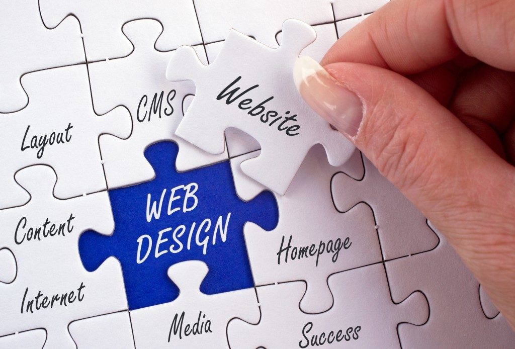
Whether for business or to attract job finders to your company, a visually pleasing website is needed. The platform is a way for you to engage with your audience. Having a poorly designed website defeats the purpose of having one anyway. It’s not going to make the engagement effective.
One element that helps draw attention to online surfers is the website’s visuals. This is the foundation of design. This even comes before your website’s content. It’s the first thing people would take notice of. Studies report that 38% of people are most likely to leave a website with an unattractive layout. If your website is not going to give the best first impression, it’ll fail.
So what are the best visual elements you can use to improve this? How can you drive traffic by using these elements? Check out these tips that you can apply to your website.
Excellent photographs
An effective way to attract website visitors is through amazing photography. People’s attention span has become shorter throughout the internet era. If you try to capture people’s attention through photographs, you need to use the best shots. You can hire a photographer to take original photos for your site. Hire someone who would understand your company or your brand’s vision. This way, the photographer will be able to effectively transform your ideas into pictures.
If you can’t find a photographer that suits your preferences, you can always use stock photos. Use the free ones if you’re short of budget. If you can spend on a monthly subscription, you can use the paid ones. This will give you access to a never-ending library of professionally shot photographs.
Lastly, these photos should load fast when they’re already on your website. A web design survey reveals that 39% of people would cease engaging with a website if it’s taking too long for the images to load. The best thing to do is compress the photos without compromising their quality. Do this before uploading them to your website.
Social media cards
Speaking of people’s short attention span, you have to cater to this perspective. If you can use social media cards to post about your product, you should do it. If you don’t know, social media cards images contain a catchy tagline and a remarkable photo. They are called social media cards because you can usually see them on these platforms.
News outlets are best known for using these as previews for their stories. But you can use these too if your social media accounts are integrated into your website. Just make sure that everything you post on social media can be seen on your website, too.
Or you can use them directly to your website as thumbnails. Link them to a specific feature you want your visitors to be redirected to. These social media cards are very easy to make. You can even download templates online to create the best ones.
Infographics and explainers

When it comes to expounding ideas, infographics and explainers are the way to go. Infographics, as the name suggests, are visual representations of data. It takes a lot of creativity and intricacy to make them. Creatives who do this aren’t just creative. Aside from design, they should also pay attention to the data and information provided.
Meanwhile, explainers are pieces of media that educate its consumers. Examples are short-form animations about politeness, produced corporate videos for company websites, text-based news bits, and many more.
Like infographics, explainers contain essential information. If you’re hiring graphic designers to do these for your websites, choose the ones who have the expertise. It’s crucial since these infographics and explainers should be accurately represented.
Simplicity
If you’ve seen Apple’s website, you’d be amazed how simple it is yet, very effective. The colors they used are mostly black and white. But the designers made the website look slick and neat instead of boring. Simple websites capture people’s attention because they can easily be digested.
This perspective stems from minimalism which is very prevalent in the world of design nowadays. You can make your website look similar. A simple-looking website is free of clutters. This helps your visitors to consume content easily. Go for this design if you feel like it’ll adequately represent your brand.
Driving traffic to your website is attainable. You have to work with the best creatives and talents. Deliver your ideas accurately to them. This is important so that they can work on the most appropriate visuals for your brand. This guide should help you attract your target audience to dive deep into your website.
